Showing posts with label Color. Show all posts

Monday, July 18, 2011

How To Create A Favicon on Blogger

What Is A Favicon?

The term Favicon is short for favorites icon and is also known as a shortcut icon, website iconURL icon, or bookmark icon.  The Favicon is a tiny image, usually 16x16, that is associated with a specific website.  You want to choose a favicon image that easily identifies your website or your brand.  Once you have created your favicon image and set up your favicon on your blog or website, then graphical web browsers can start to implement it into your sites design. 

Browsers that provide favicon support typically display a page's favicon in the browser's address bar and next to the page's name in a list of bookmarks. Browsers that support a tabbed document interface typically show a page's favicon next to the page's title on the tab, and site-specific browsers use the favicon as a desktop icon.


Favicon Display On Browser Tabs

How To Set Up Your Favicon On Blogger

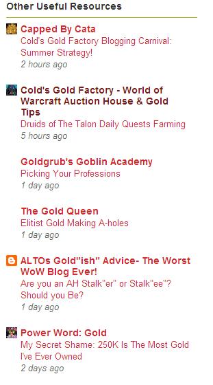
Blogger has recently added a super easy way to add a favicon to your Blogger blog.  All you need to set up a favicon is a square image.  You want to select an image that is easily identified as being related to your site.  You can choose a portion of your Blogger blogs header, your site's logo, or another identifying image that instantly is associated with your site.  The image below shows a blogroll from a fellow blogger's Blogger blog.  You can note the top 2 and the last site are Blogger sites that are using a favicon set up through their Blogger site design.  The 5th site in the blogroll shows a Blogger blog site that is using the default Blogger orange and white Blogger B logo.  That is what your favicon looks like prior to personalizing it to match your site.

Blogger Blogroll With Favicons Displayed

Step By Step Guide To Setting Your Blogger Favicon

1)  The first step is to select the image you would like to use.  The only requirement is that the image is a square shaped image.  The Blogger platform will size the image down to the correct size for the favicon display.  The image will be sized down to 16x16 for display on Blogger sites, so you don't need to use a high resolution image. 

Blogger Favicon Set Up
2)  Once you have your favicon image selected, click on the Dashboard tab in the Blogger interface.  First select the Design Tab and then select the Edit Favicon option.  You can see the Favicon tab in the design elements option where you add gadgets and restructure your Blogger site's design.  See the above image for reference, if you need help locating the favicon editing tab.


Blogger Favicon Custom Upload
3)  After clicking the Edit Favicon tab, the above window will pop-up.  This is where you upload the custom image you have created for your favicon image.  Just click Browse and find the square image file to upload.  Save your changes and you are all set.  When I did this the first time, the image was displayed as my Favicon on the design panel, but it took a day for the favicon to start showing up around the Blogger blogs and to start appearing in the various browsing tabs.

Setting up your Blogger favicon is pretty easy once you have decided on and created an appropriate matching image.  Be sure to set your Blogger favicon up today to give your site a little bonus aesthetically, which also helps to build your brand's image.
  • Why Haven't You Set Your Favicon Up Yet On Your Blogger Site?
  • Have You Seen Any Other Benefits To Having A Favicon For Your Site?

Saturday, December 11, 2010

Accounting For Color Blindness In Site Design

Can You See the 74?

Do you know that 1 in 12 visitors to your site may have some form of color blindness? 


Color Blindness Or Weakness

Color blindess or weakness is something to consider when picking the right colors for your site.  The incidence of color blindess among your visitors may be much more common if you are targetting a niche dominated by males.  I won't bore you with the scientifics of color blindness, but here are a few things to consider when working on your site's design.
  • Over 90% of color blind people have trouble seeing reds and greens.
  • They can see black and white.
  • Red-Green color weakness doesn't affect the ability to all shades of yellow and blue.
  • They can see dimmer shades of yellow, such as gold.
  • They can tell the difference between bright colors contrasted with dark colors.
  • Reds and Greens of all shades give the most problems.
  • Blue-Yellow blindness is very rare and tends to not be genetic (can result from alcoholism or head trauma).
Account For Color Blindness in Design

Remember these pointers when designing your site so you don't alienate a part of your audience.  This is more important in male dominated niches, but should be considered by all site designers.  Try not to use a lot of reds and greens in your layouts.  Try to use colors with a high light and dark contrast.

Image Credit:  http://www.colorvisiontesting.com/

Friday, December 10, 2010

Picking The Right Colors For Your Website Or Blog

Importance of Color

As soon as someone lands on your homepage, blog, or landing page they will instantly form opinions and react to what colors your site is displaying.  This can be the difference between someone staying and reading your site or someone quickly hitting the back button in no time.  Color should be an important decision when designing your site.  Having a nice color combination can be warm and inviting, just as having a horribly clashing color combination can scare off readers before they read a single word.  Color is a factor to consider.
Consider What Message Each Color Portrays

  • Blue - (most popular) suggests honesty, trustworthiness, calming, and loyalty.
  • Black - displays authority, sophistication, power, elegance, and technical prowess.
  • White - symbolizes purity, peace, and youth: neutral and clean.
  • Red - excites with passion, energy, and excitement.
  • Pink - suggests innocence, softness, and sweetness.
  • Green - invites feelings of nature, growth, and regeneration.
  • Dark Green - implies wealth and conservatism.
  • Yellow - is optimistic and cheery, yet can come across as too dominating if overused.
  • Purple - is associated with wealth, sophistication; and mystical, spiritual tones.
  • Brown - is genuine, although it often emotes sadness.
  • Orange - conveys happiness, freedom, creativity, playfulness, and confidence.
  • Gold - as you would expect, suggests expensive taste as well as prestige.
  • Silver - also emotes prestige but is cold and more scientific.
  • Gray - has a more corporate, somber, and practical appeal.
*Chart taken from the book Web Marketing All-In-One For Dummies by John Arnold, et al.

Do the colors on your site reflect or contradict the message you are trying to send?